TEMU UX AUDIT & REDESIGN

Redesigning cluttered e-commerce for clarity, accessibility, and faster task completion

Heutistic Evaluation

User Testing

UX Research

UI Design

Figma

Miro

Heuristic audit of Temu's mobile shopping flow, identifying accessibility barriers from excessive promotions and visual noise.

Redesigned purchase flow with streamlined hierarchy, reduced distractions, and improved clarity. Validated through guerrilla testing.

1 week

Redesigned Temu mobile welcome animation - removing pop-up ad

PROBLEM

E-commerce platforms prioritize aggressive promotion over user experience, cluttering interfaces with pop-ups and urgent messaging. Temu exemplifies this with excessive promotional content at every stage, violating minimalist design principles.

These distractions present particular barriers to users with cognitive disabilities or visual processing challenges who need clear hierarchy and simple workflows.

Everyone deserves inclusive shopping experiences. The business perspective: frustrated users abandon shopping and purchases, reducing conversions, despite aggressive tactics.

Original Temu mobile shopping flow with promotional banners and cluttered UI

Excessive promotions and visual clutter at every stage violate minimalist design principles and increase cognitive load.

Behaviors & Needs:

  • Seeks quick, efficient online shopping without promotional overload
  • Sensitive to usability barriers
  • Frustrated when repetitive banners and competing colors slow navigation
  • Wants interfaces to respect processing

Amanda

SEND Specialist

Age 34

"I just want to buy something without visual assault."

Behaviors & Needs:

  • Shops online for budget-friendly items but overwhelmed by complex interfaces
  • Needs clear visual hierarchy and simple language to navigate confidently
  • Distracted by messaging and pop-ups
  • Relies on familiar, consistent patterns

Robert

Limited Tech Exp.

Age 68

"All these flashing sales make me anxious - I can't find anything."

Behaviors & Needs:

  • Shops during breaks
  • ADHD makes competing visual elements particularly distracting
  • Abandons purchases when interface feels overwhelming or confusing
  • Values clear task flow without promotional interruptions

Maya

Student with ADHD

Age 22

"I came to buy one thing and got lost in pop-ups."

Constraints

Environment

  • Balance business promotional needs with improved usability
  • Quick audit timeline - limited to mid-fidelity redesign scope
  • Guerrilla testing with small participant pool only
  • Redesign balances accessibility improvements with conversion goals

Goals

  • User: Locate items, add to cart, and checkout quickly without promotional distraction.
  • Design: Redesign purchase flow for clarity, speed, and inclusivity through heuristic evaluation.
  • Business: Improve conversions by reducing friction (clear interfaces outperform aggressive promotion).

PROCESS

1 | RESEARCH

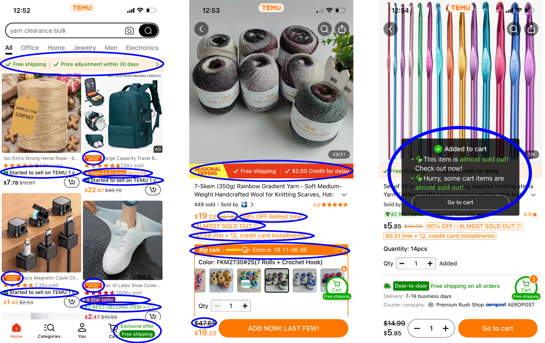
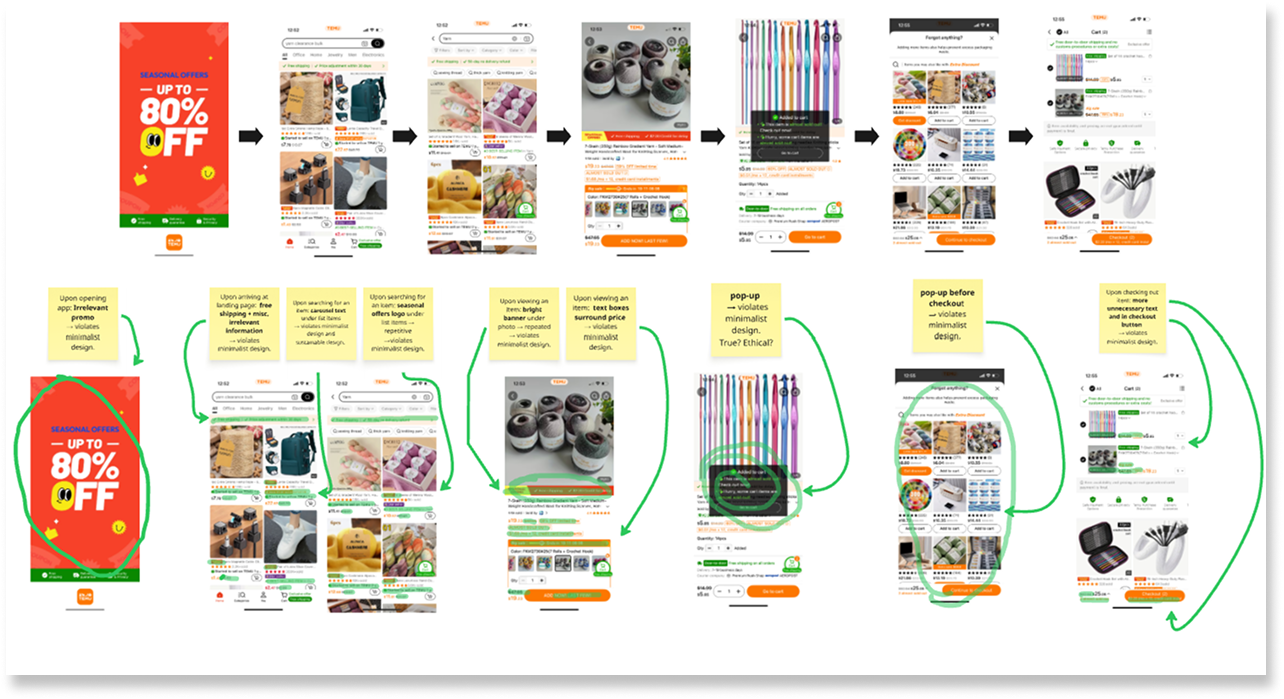
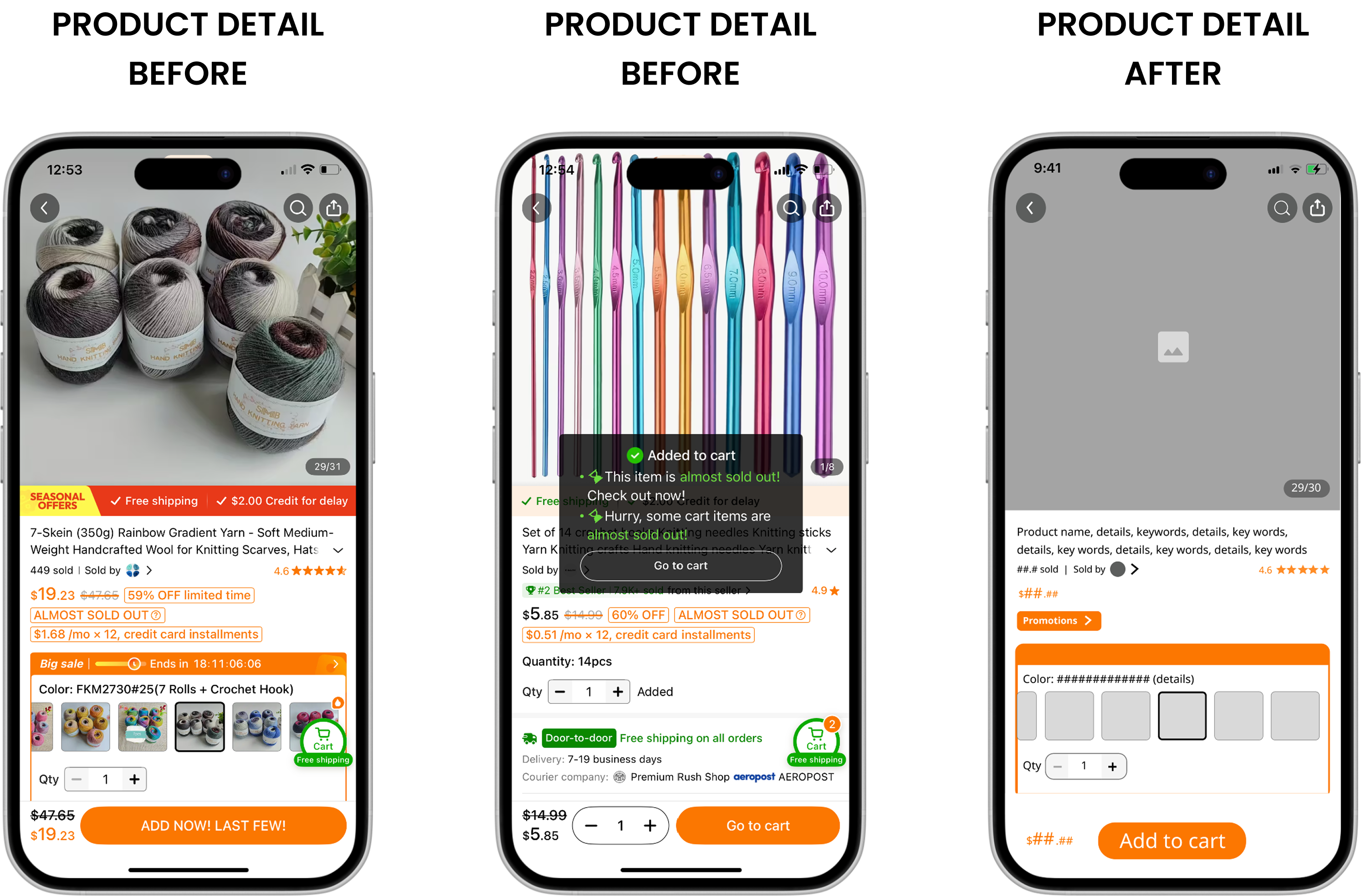
Walked Temu's full purchase flow as an auditor, systematically documenting every violation of Nielsen's Aesthetic and Minimalist Design principle with evidence, not opinion.

2 | DEFINE

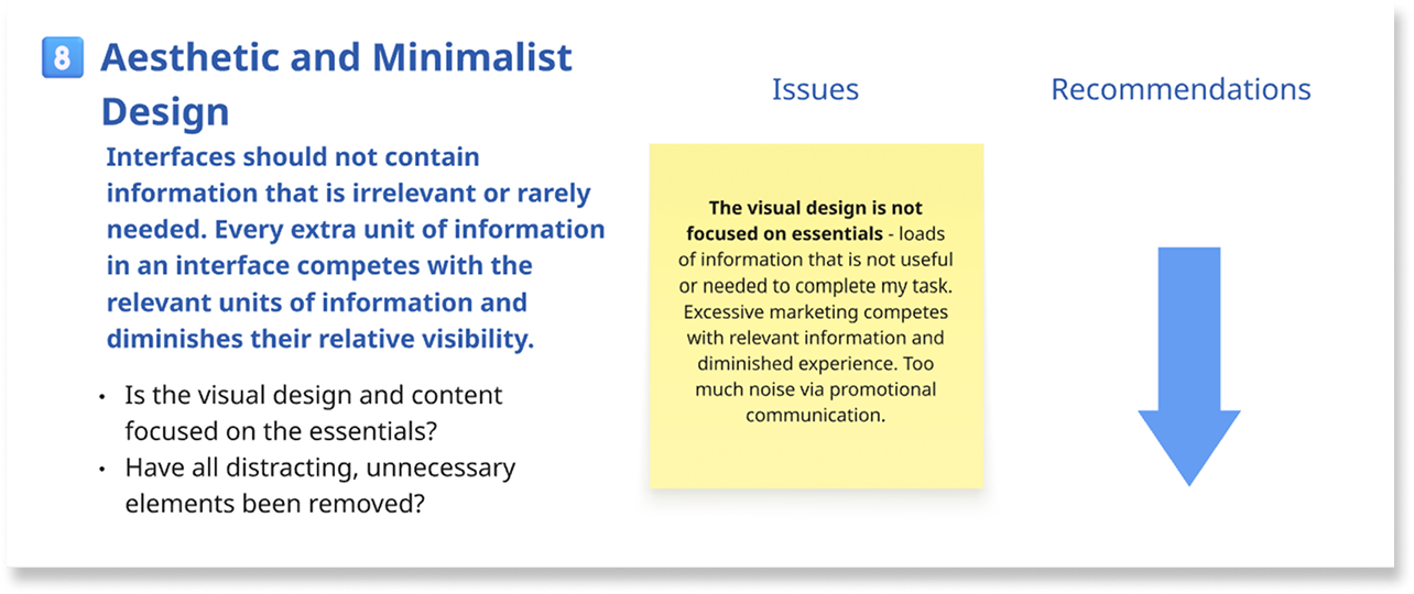
Synthesized audit findings through an accessibility lens shaped by my special education background, identifying exactly how visual clutter creates barriers for users with ADHD, dyslexia, visual impairments, and processing challenges.

3 | IDEATE

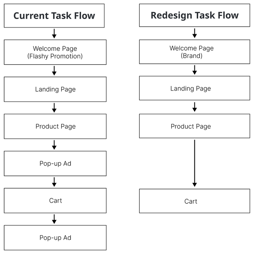
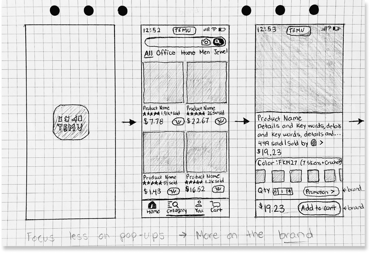
Progressed from sketches to wireframes with documented decision rationale at each step, deliberately balancing simplification against business promotional requirements, not ignoring them.

4 | PROTOTYPE

Mid-fidelity redesign targeting the full purchase flow: consolidated promotions, removed redundant banners, clarified checkout labels, eliminated pressure tactics without eliminating the business case.

5 | TEST

Personal walkthrough followed by guerrilla testing, measuring task completion ease and capturing qualitative feedback on cognitive load and clarity.

6 | ITERATE

Discovered a real testing constraint: participants needed guidance adjusting device views to evaluate the prototype accurately. Refined responsive behavior and updated testing protocol in response.

Presentation of Nielsen's Aesthetic and Minimalist Design principle violations

Heuristics audit focusing on aesthetic and minimalist design

Affinity map displaying identifying exactly how visual clutter creates barriers

Synthesized findings in affinity map

Original Temu mobile shopping flow with promotional banners and cluttered UI

Developed a streamlined purchase flow

Initial sketch of Redesigned Temu mobile purchase flow with simplified hierarchy and clearer interface

Progressed from early sketches to mid-fidelity prototype

Key Decisions

1 | Centralized Promotions Into One Zone

DECISION

Centralized promotions into single designated space, not eliminated.

RATIONAL

Business requires promotional content for revenue. Consolidating into dedicated section respects business needs while preventing promotions from competing with core shopping tasks.

TRADEOFF

Reduced promotional visibility might lower impulse purchases, but improved task completion, reduced abandonment, and brought user to futher shopping - likely increasing overall conversion.

2 | Removed Urgency & Pressure Tactics

DECISION

Removed urgent messaging: countdown timers, scarcity warnings, pressure tactics.

RATIONAL

Urgency messaging creates anxiety and cognitive load, particularly harmful for users with processing challenges. Trust-building clarity drives sustainable conversion.

TRADEOFF

Lost persuasion technique commonly used in e-commerce, but ethical design and accessibility compliance outweighed manipulative tactics that erode user trust long-term.

3 | Minimal, Low-Cognitive Checkout Flow

DECISION

Simplified checkout with minimal text and consistent visual hierarchy.

RATIONAL

Checkout abandonment peaks when users feel overwhelmed. Clean, predictable interface reduces cognitive load and builds completion confidence - critical for users with disabilities.

TRADEOFF

Reduced space for cross-sells during checkout, but conversion completion improvements justify losing last-minute upsell opportunities that often cause abandonment.

Design solutions

Before redesign: Entry screen promotional banners and cluttered UI  / After redesign: Entry screen with simplified brand representation, hierarchy and clearer interface

Removed exclusive pop-up overlay on entry  |   Eliminated aggressive entry barrier
Shifted focus to promote brand reliability

Before redesign: Browsing screen promotional banners and cluttered UI  / After redesign: Browsing screen with simplified brand representation, hierarchy and clearer interface

Simplified product cards - removed competing colors, excessive urgency text
Clean hierarchy focuses on products

Before redesign: Product screens promotional banners and cluttered UI  / After redesign: Product screen with simplified brand representation, hierarchy and clearer interface

Removed redundant banners, excessive promotional text cards, countdown timer and "almost sold out!" pop-up overlay
Streamlined information reduces cognitive load

Before redesign: Cart screen promotional banners and cluttered UI  / After redesign: Cart screen with simplified brand representation, hierarchy and clearer interface

Eliminated urgent checkout messaging and "Forgot Anything?" pop-up overlay
Calm checkout builds confidence

Outcomes

Expected Impact:

Redesigned purchase flow reduced visual noise by consolidating promotional content into a single zone, shortening the path to checkout and removing 4+ friction points identified in the heuristic audit.

User Feedback:

Guerrilla testing confirmed the redesign landed: users described the experience as 'calm' and 'easier to focus,' with measurably smoother task completion compared to the original flow.

Heuristic Improvement:

Heuristic audit identified 6+ violations of Nielsen's Aesthetic and Minimalist Design principle. Redesign addressed each systematically, with particular impact for users with ADHD, visual processing differences, and limited tech experience.

Learning

What Worked

Heuristic evaluation revealed accessibility barriers

What Changed

Shifted from elimination to consolidation

What I'd Improve

Conduct WCAG validation and diverse testing

What Surprised Me

Simplification improved business case, not just UX

Looking for a Product Designer who brings strategic, critical thinking and user empathy?

Let's talk.

Resume  |  Contact